
“After 15 years in the industry, we have had the privilege of meeting many professionals, working on simple tasks to complex projects. We have experienced the highs and the lows, learned from some of the best minds in the field, and grown through those experiences. We have built teams, set up manual and automated fulfilment centres, and navigated countless challenges along the way.
If you’re looking for more than just advice—if you’re looking for a true partnership—let’s talk!”
Tom, Founder of Kaba Partners


We strive to enhance efficiency, reduce operational costs, and promote environmental responsibility in all aspects of warehouse management.
Kaba Partners brings together years of experience in warehouse design, process optimisation and technology integration. Our deep understanding of the unique challenges faced by businesses, small or large organisations, allows us to tailor solutions that are both effective and scalable.

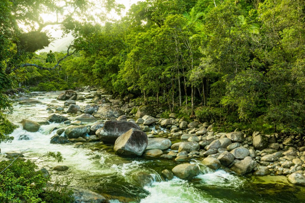
The Daintree Forest is more than a place —
it is a living echo of time itself.
At over 180 million years old, it stands as the oldest tropical rainforest on Earth —
a symbol of resilience, uniqueness, adaptability, and sustainable harmony with nature.
We couldn’t imagine a more powerful inspiration.
There was no better name to carry the spirit of who we are at Kaba Partners.
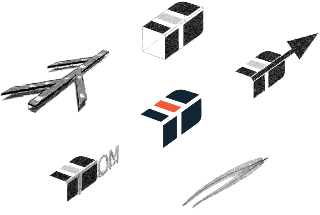
The Kaba Partners logo was born from a series of vibrant creative sessions shared among friends — led by the brilliant Emilien Rosson, who brought the vision to life through his design.
At first glance, the logo may appear simple. But within its bold lines and precise angles lies a layered story, told through five symbolic elements:
An arrow, pointing upward to the right — a sign of progress, growth, and forward thinking.
The feather of a cassowary, a subtle tribute to the Daintree Forest — a symbol of resilience, strength, and natural uniqueness.
A stylised conveyor system, echoing the automation and rhythm of modern fulfilment.
A box, representing the movement of goods and, more importantly, the customers we serve.
And tucked into the design, a quiet nod to our founder — the letter “T”, for Tom.
The colours that run through our logo — and across the entire Kaba Partners brand — are inspired by the wild, ancient tones of the Daintree Forest. They reflect not just a place, but a spirit: raw, powerful, and endlessly alive.

We are committed to delivering exceptional value through collaboration, innovation, and a deep understanding of your needs.